
Follow Running Timers in the Active Tab
The Active tab holds your active timers and allows you to control them. You can also start simple Quick Timers from here, or repeat recently completed timers. You can run several timers in parallel, and each of them gets its own timer view.
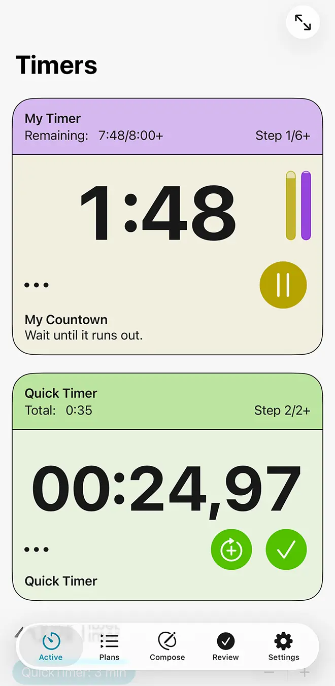
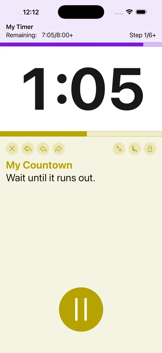
The Timer View
Each timer view has up to three main segments.
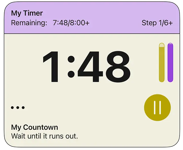
Timer Header: Your Overall Timer (1)If your timer consists of more than one step, you will see information about the state of the total timer at the top. This will be color-coded with the color you picked for your timer. Details shown include the name of your overall timer, the total elapsed and remaining time and completed steps. If your timer only has one step, like a Quick Timer, this segment will not be shown.
The Main Display (2)The central part of the timer view shows the progress of the currently active timer step. For a countdown timer, it shows the remaining time, counting down. For a stopwatch, it shows a stopwatch display, counting up. And if you are at a junction requiring a choice on your part, such as deciding how to continue or whether you want to repeat some or all of your timer, there is a question mark. Both the main display and the bottom segment are colored based on the color you picked for the step that is currently active.
Bottom Segment: Controls and InformationThe bottom segment provides controls for your timer as well as information about the currently active step. Immediately below the main display are controls affecting your timer. On the right hand side is the main control (3), which provides the most common interaction based on the current context, indicated by an icon.
- For a timer that you haven’t started yet, it shows a play icon and starts your timer
- If a countdown timer is currently running, it shows a pause icon and lets you pause the timer
- If a countdown timer is currently paused, it shows a play icon and using it resumes your timer
- If a step requires a confirmation on your part, it shows a checkmark and allows you to confirm
- And for a finished timer, it lets you finalize it and remove it from view.
- If you are currently given a choice, the main control button isn’t shown. Instead you get a menu with the available options.
- Stopwatch steps always have a checkmark that lets you finish that stopwatch, log the time, and continue. Additionally, if the stopwatch is configured to allow you to add rounds, there is another large control button. The Add Rounds button will also finish the current stopwatch step and log the time, but repeat it right away for another round.
At the left hand side below the main display there are other controls for your timer. The way these are displayed depends on the number of controls available in the current context and the available space. Usually, they are consolidated in a menu.
- Cancel: if you haven’t started the timer yet, this simply removes it. If it is active, you are given a choice to save any completed steps for review or discard and remove the timer.
- Reset Step, Move Back, and Skip: available in a multi-step timer, these let you restart the currently active step, move to the previous one, or move to the next step.
- Restart Timer: for a timer that has just been completed, this lets you do it again right away. This doesn’t affect the data for the timer you’ve just completed.
- Pause and Resume: for stopwatches, pausing and resuming are in Other Controls.
Below the controls is the name of the currently active step, or a placeholder if you haven’t defined any. It is followed by the instructions you have provided for the current step. This is available for countdown timers and stopwatches.
Decision MenusIf your timer is currently offering you a choice, a menu giving you the available options is at the bottom of your timer view. This could be if you configured a timer element to allow additional repeats: in this case, there is the name of the element to repeat and a simple yes/no question. Or if you have arrived at a choice element, all the options you have set for that choice will be given with their names and durations, and the possibility to skip all if enabled by you.
The Full-Screen ButtonIn the top bar is the Full-Screen button. This changes to the full-screen view for your timers. If you set your timer to prefer full-screen mode in its timer plan, or if you activated full-screen mode for all timers or the category of a current timer, you will enter full-screen mode right away.
TopQuick Timers
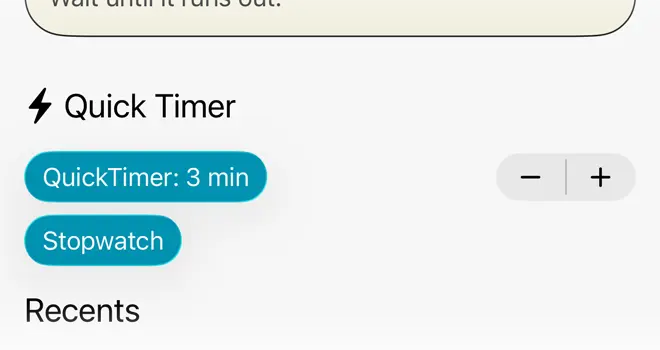
Below your active timers, if any, there are controls to start Quick Timers. A Quick Timer is a simple, one step countdown timer or a stopwatch. You can adjust the duration of the timer in one-minute increments up to 30 minutes. Quick Timers belong to the General category and play a default alert at the end that you can configure in the Settings tab. Unlike other timers, Quick Timers will also start right away, without any further interaction.
TopRecent Timers
Quick Timers
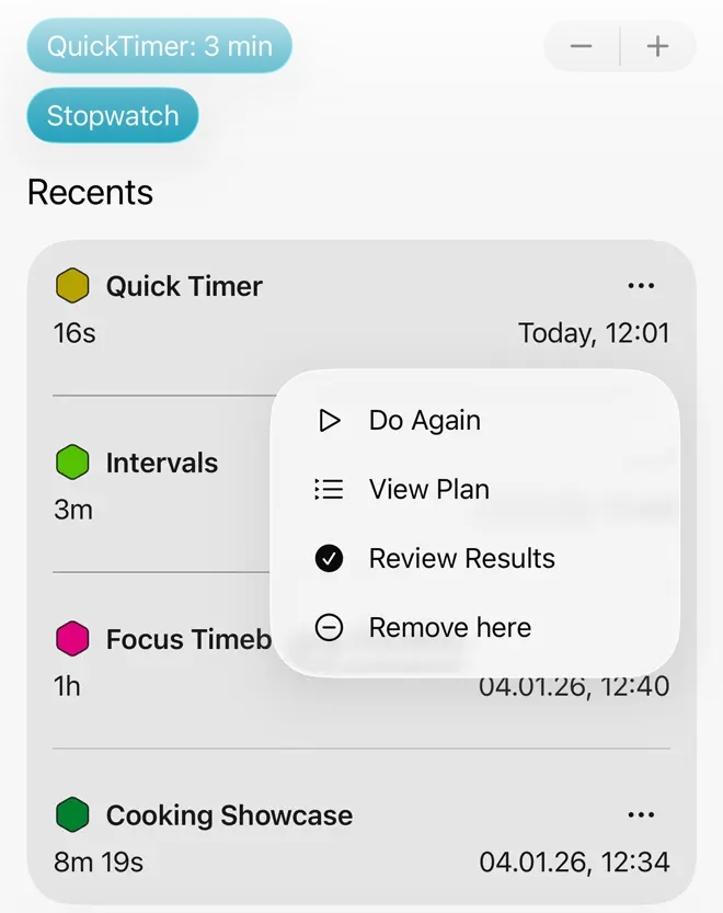
At the bottom of the view there is a list of your most recently completed timers. The entries list their names, durations, and completion dates. The context menu allows you to repeat that timer, inspect the results in the Review tab, view the timer plan for this timer, or remove this entry from view.
TopFull-Screen Timers
Full-screen mode gives you a focused display for your timers. It is set by default for the Sports category and can be set by you as a preference for individual timer plans (when editing the plan), or in Settings for certain categories or all timers. Full-screen timers use a different layout for portrait and landscape views. The arrangement for portrait orientation is described first.
Tabs in Full-Screen ModeThe standard tabs to change to the Plans, Compose, Review, or Settings views aren’t available in full-screen mode. Instead, tabs are only shown if you have multiple timers running in parallel. Then, you can use them to switch between those timers.
Timer Header: Your Overall Timer (1)If your timer consists of more than one step, you will see information about the state of the total timer at the top. This will be color-coded with the color you picked for your timer. Details shown include the name of your overall timer, the total elapsed and remaining time and completed steps. If your timer only has one step, like a Quick Timer, this segment will not be shown.
The Main Display (2)Below the header you can see the progress of the currently active timer step. For a countdown timer, it shows the remaining time, counting down. For a stopwatch, it shows a stopwatch display, counting up. And if you are at a junction requiring a choice on your part, such as deciding how to continue or whether you want to repeat some or all of your timer, there is a question mark. For maximum contrast, the main display in full-screen mode is bright/dark for light and dark mode respectively.
Bottom Segment: Controls and InformationThe bottom segment provides controls for your timer as well as information about the currently active step. It uses a color scheme based on that chosen by you for the currently active timer element.
Right at the bottom is a large bottom offering the main control (3) for your timer, which provides the most common interaction based on the current context, indicated by an icon.
- For a timer that you haven’t started yet, it shows a play icon and starts your timer
- If a countdown timer is currently running, it shows a pause icon and lets you pause the timer
- If a countdown timer is currently paused, it shows a play icon and using it resumes your timer
- If a step requires a confirmation on your part, it shows a checkmark and allows you to confirm
- And for a finished timer, it lets you finalize it and remove it from view.
- If you are currently given a choice, the main control button isn’t shown. Instead you get a menu with the available options.
- Stopwatch steps always have a checkmark that lets you finish that stopwatch, log the time, and continue. Additionally, if the stopwatch is configured to allow you to add rounds, there is another large control button here. The Add Rounds button will also finish the current stopwatch step and log the time, but repeat it right away for another round.
Immediately below the main display there are additional controls for your timer. In full-screen mode, these are usually displayed as individual buttons, but they may be consolidated into a menu if space-constrained.
- Cancel: if you haven’t started the timer yet, this simply removes it. If it is active, you are given a choice to save any completed steps for review or discard and remove the timer.
- Reset Step, Move Back, and Skip: available in a multi-step timer, these let you restart the currently active step, move to the previous one, or move to the next step.
- Restart Timer: for a timer that has just been completed, this lets you do it again right away. This doesn’t affect the data for the timer you’ve just completed.
- Pause and Resume: for stopwatches, pausing and resuming are in Other Controls.
- Full-screen mode also gives you additional options.
- Lock Controls: this is a toggle that allows you to prevent unwanted changes to your timer. When activated, you first have to unlock this to interact with your timer.
- Prevent Display Sleep: if this toggle is enabled, your phone display won’t go to sleep after some idle time as usual. This will of course require some battery power and is automatically disabled on leaving full-screen mode.
- Leave Full Screen: use this button to leave full-screen mode and change to the standard display.
Between the main control and the additional controls is the name of the currently active step, or a placeholder if you haven’t defined any. It is followed by the instructions you have provided for the current step. This is available for countdown timers and stopwatches.
Decision MenusIf your timer is currently offering you a choice, a menu giving you the available options is at the bottom of your timer view. This could be if you configured a timer element to allow additional repeats: in this case, there is the name of the element to repeat and a simple yes/no question. Or if you have arrived at a choice element, all the options you have set for that choice will be given with their names and durations, and the possibility to skip all if enabled by you.
Landscape Orientation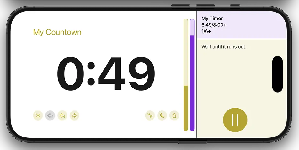
Full-screen timers have a changed layout in landscape orientation. Here, the main display for your timer takes up most of the screen, on the left hand side. Information about your overall timer is placed in the top right corner. And the name of your current active element, instructions and the main control are placed in the bottom right corner. This offers less space for names and instructions than in portrait orientation, so parts may be omitted when space-constrained. The additional controls, including the button to leave full-screen mode, are placed in the main display below the text showing the progress of your current step. And decision menus are also placed in the main display section as an overlay, and contain the additional control buttons.
Top